![]()
Productivity Charts
Viewing Productivity Charts
These charts display the efficiency of the services provided by the organisation's staff and/or sites.
Use the drop down lists (at top of the chart) to filter the chart data by a specific Period (last 1, 3, 6 & 12 Months), Site and/or Class.
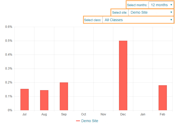
The Productivity Charts
Click on a Productivity chart below for a more detailed description:
| CHART | OVERALL DESCRIPTION |
|---|---|
| Number of Appointments per Site | This chart displays the number of appointments per site for a specified duration. |
| Number of Appointments per Provider |
This chart displays the number of appointments per provider for a specified site and duration. |
| Provider Saturation |
This chart displays the demand percentage per provider for a specified site and duration. |
| Number of Cancellations and DNA per Site |
This chart displays the number of Cancelled and DNA (Did Not Attend) appointments per site for a specified duration. |
| First Appointments per Site |
This chart displays the number of First Appointments per site for a specified duration. |
| Wages Revenue per Provider |
This chart displays the relation between benefits generated and payroll-related expenses (for specific provider/s) for a specified duration. |
| Class Saturation |
This chart displays the attendance percentage per class for a specified site and duration. |