![]()
GPM Web Dashboard
Using GPM Web, you can keep track of main accounting and productivity metrics.
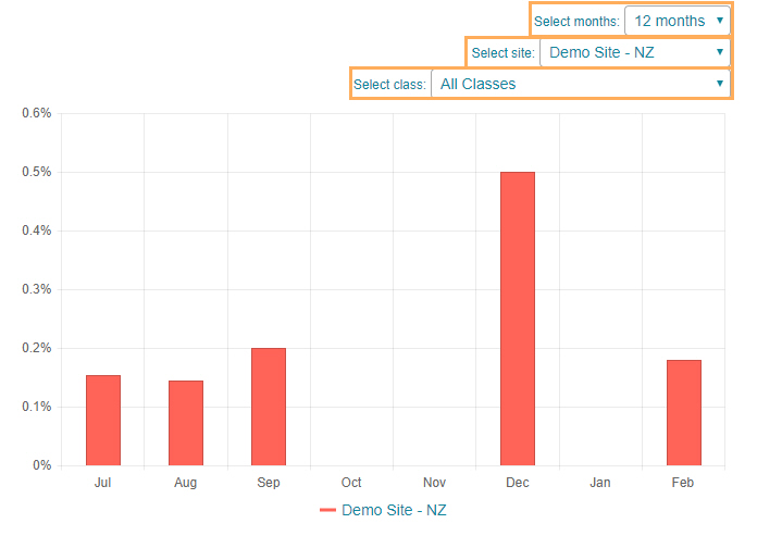
For each chart, you will be able to configure the display using a number of filters: Duration, Site, Vendor, etc....
Viewing a GPM Web Chart
You will be able to filter each chart data as follows:
-
Select the Site, Duration and/or Class you want to see the chart for. They will appear as drop-down lists at top of each chart.
-
Hover the mouse cursor over the chart to show the data..
-
To display data for selected users only, use the labels at the bottom of the chart. Tick/Untick on a label to include/exclude the data from the chart.

Click on a chart category below for a more detailed description of each chart within it:
- Marketing: These charts display the efficiency of exchange relationships.
- Productivity Charts: These charts display the efficiency of the services provided by the organisation's staff and/or sites.